Apple Corporate
How did someone start a project at Apple in the ’80s?
You generated a PRF (Project Requisition Form) for a project logo and a T-shirt. Oh, and throw in a button while you’re at it.
Over the course of a year, my corporate design team handled more than 100 such requests. Some were important initiatives; others not so much. They were nothing more than team-building FOMO projects.
It was tempting to ask: Why bother?
If it was for a team-building event, I usually pushed back—unless it was somewhere exotic and I got to scout the location, as I did for Apple’s annual sales meetings. Sometimes, I let small, time-consuming projects through simply to give my team some variety. Year after year of plopping the Apple logo onto pictures of people working on computers could get monotonous and limit a designer’s opportunities to think differently. I saw these projects as design workshops, as well as an excuse to work with designers, illustrators, and photographers I admired.
I also believed that a corporate identity program didn’t have to take a cookie-cutter approach, applying the same visual style or formula to every piece of communication. Technology marketing was already restrictive: being literal and showing everything explicitly was almost a requirement. Projects that didn’t require us to show products were a treat to design for.
Because the work was intended for an internal audience, production runs were small and exposure was limited. Designers on my team entered these pieces into competitions, but more often than not, they weren’t accepted. Much of the work survived only in personal portfolio archives.
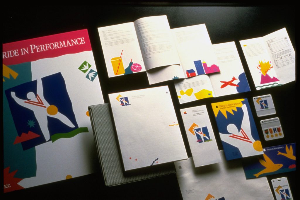
The pieces shown here come from my archive and were created by my talented team members, some of whom went on to have remarkable design careers. As the creative director on these projects, I’m proud of the work we did and even prouder of the people who made it.